


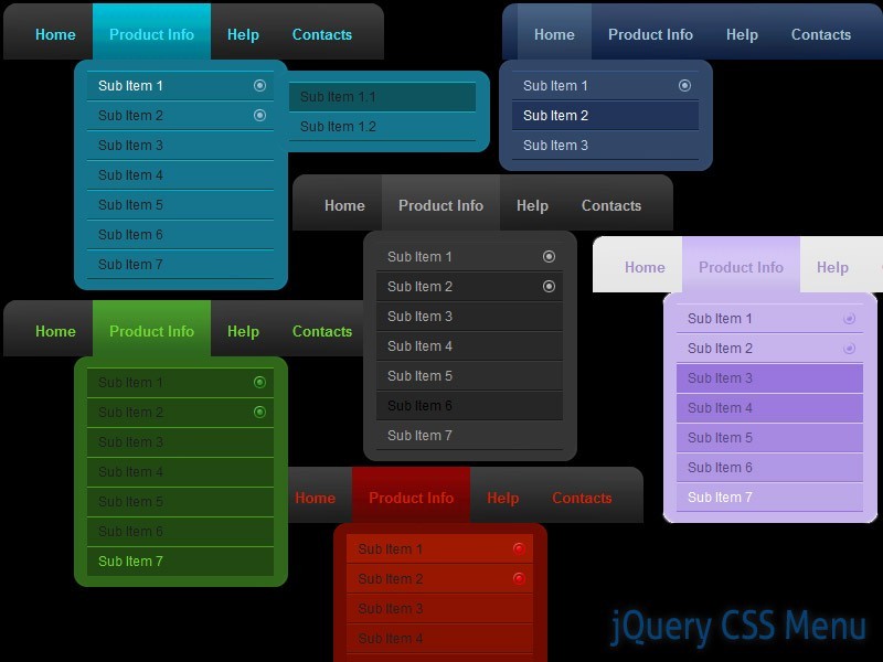
Neste post falarei aqui no DicasHot a respeito de como colocar em seu blog um elegante menu css3 bem na lateral do seu blog. Esse menu é expansível, ou seja, ao passar por cima dele com o cursor do mouse, automaticamente ele abre uma pequena aba com um nome específico. Veja o exemplo na figura ao lado.
Para indexar este menu no seu blog, primeiro: entre no painel do seu blog, clique em "Design" e "Editar HTML". Feito isto clique em "".
Cole o código abaixo antes de ]]></b:skin>
/* Inicio Menu Css3 vertical - http://www.dicashot.blogspot.com */
#hor {
list-style:none;
padding:0;
margin:0;
}
#hor li {
float:left;
padding:5px;
}
#hor a {
display:block;
height: 12px;
text-indent:-999em;
}
#hor a.home {
width:46px;
background:url(vHome.gif) no-repeat 0 0;
}
#hor a.download {
width:94px;
background:url(vDownload.gif) no-repeat 0 0;
}
#hor a.contact {
width:74px;
background:url(vContact.gif) no-repeat 0 0;
}
/* CSS Style for Vertical Menu */
#ver {
list-style:none;
padding:0;
margin:0;
}
#ver li {
padding:2px;
}
#ver li a {
display:block;
height:12px;
text-indent:-999em;
}
#ver a.home {
width:47px;
background:url(hHome.gif) no-repeat 0 0;
}
#ver a.download {
width:95px;
background:url(hDownload.gif) no-repeat 0 0;
}
#ver a.contact {
width:74px;
background:url(hContact.gif) no-repeat 0 0;
}
.clear {
clear:both;
}
*{
/* A universal CSS reset */
margin:0;
padding:0;
}
#navigationMenu body{
font-size:14px;
color:#666;
background:#111 no-repeat;
/* CSS3 Radial Gradients */
background-image:-moz-radial-gradient(center -100px 45deg, circle farthest-corner, #444 150px, #111 300px);
background-image:-webkit-gradient(radial, 50% 0, 150, 50% 0, 300, from(#444), to(#111));
font-family:Arial, Helvetica, sans-serif;
}
#navigationMenu li{
list-style:none;
height:39px;
padding:2px;
width:40px;
}
#navigationMenu span{
/* Container properties */
width:0;
left:38px;
padding:0;
position:absolute;
overflow:hidden;
/* Text properties */
font-family:'Myriad Pro',Arial, Helvetica, sans-serif;
font-size:18px;
font-weight:bold;
letter-spacing:0.6px;
white-space:nowrap;
line-height:39px;
/* CSS3 Transition: */
-webkit-transition: 0.25s;
/* Future proofing (these do not work yet): */
-moz-transition: 0.25s;
transition: 0.25s;
}
#navigationMenu a{
background:url('https://blogger.googleusercontent.com/img/b/R29vZ2xl/AVvXsEhBIOstToW11OP50n0F-Hp9ENcgToQY4_qpULDTZ-T-wpf21nbzRJuPuQ8n4nCiXaWbiX-QcZ3Hb18ThPFB_jHMMju7HREq687eqYVsmQsQvCKRfrciDuPdnk5AAkCm-bwULtaJJ_yj6IqG/s1600/navigation.jpg') no-repeat;
height:39px;
width:38px;
display:block;
position:relative;
}
/* General hover styles */
#navigationMenu a:hover span{ width:auto; padding:0 20px;overflow:visible; }
#navigationMenu a:hover{
text-decoration:none;
/* CSS outer glow with the box-shadow property */
-moz-box-shadow:0 0 5px #9ddff5;
-webkit-box-shadow:0 0 5px #9ddff5;
box-shadow:0 0 5px #9ddff5;
}
/* Green Button */
#navigationMenu .home { background-position:0 0;}
#navigationMenu .home:hover { background-position:0 -39px;}
#navigationMenu .home span{
background-color:#7da315;
color:#3d4f0c;
text-shadow:1px 1px 0 #99bf31;
}
/* Blue Button */
#navigationMenu .about { background-position:-38px 0;}
#navigationMenu .about:hover { background-position:-38px -39px;}
#navigationMenu .about span{
background-color:#1e8bb4;
color:#223a44;
text-shadow:1px 1px 0 #44a8d0;
}
/* Orange Button */
#navigationMenu .arquivo { background-position:-76px 0;}
#navigationMenu .arquivo:hover { background-position:-76px -39px;}
#navigationMenu .arquivo span{
background-color:#c86c1f;
color:#5a3517;
text-shadow:1px 1px 0 #d28344;
}
/* Yellow Button */
#navigationMenu .marcadores { background-position:-114px 0;}
#navigationMenu .marcadores:hover{ background-position:-114px -39px;}
#navigationMenu .marcadores span{
background-color:#d0a525;
color:#604e18;
text-shadow:1px 1px 0 #d8b54b;
}
/* Purple Button */
#navigationMenu .contato { background-position:-152px 0;}
#navigationMenu .contato:hover { background-position:-152px -39px;}
#navigationMenu .contato span{
background-color:#af1e83;
color:#460f35;
text-shadow:1px 1px 0 #d244a6;
}
/*End Menu Css3 Vertical - http://www.dicashot.blogspot.com */
Feito isto, salve seu template!
Vá em Layout → Layout → Clique em Adicionar um Gadget → Escolha HTML/JavaScprit → Copie o código abaixo e cole no gadget:
<div style='position: fixed; top: 40%; left: 0%;'/>
<ul id="navigationMenu">
<li>
<a class="home" href="#">
<span>Home</span>
</a>
</li>
<li>
<a class="about" href="#">
<span>About Us</span>
</a>
</li>
<li>
<a class="arquivo" href="#">
<span>Arquivo</span>
</a>
</li>
<li>
<a class="marcadores" href="#">
<span>Marcadores</span>
</a>
</li>
<li>
<a class="contato" href="#">
<span>Contato</span>
</a>
</li>
</ul>
</div>
Substitua o que está em vermelho (#) pelo link que você desejar.
Salve e pronto! Está feito!
Gostou deste post?
Se inscreva e receba nossas atualizações por e-mail:


)